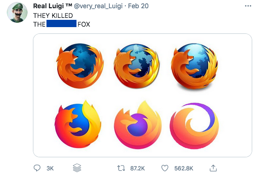
As a result of this trend, it’s become expected to see brands tear themselves apart. Below is a tweet of Firefox logo changes, with each iteration losing more and more details. The result is eventually primitive-looking shapes and colors. This image isn’t entirely accurate, however. The last “logo” in the tweet is fake, that logo isn’t the current logo for Firefox. But, it goes to show the rate at which companies are moving and the little hold that the public hast to sway their decisions, too.